CLIENT
A company that organize In-House Academies at an entrepreneur’s location (A)
about a theme appropriate at the hosting company.
An other trainer/entrepreneur (B) shares his best practice to other business people (C).
In that way, there is a maximum cross pollination for all 3 parties.
The client asked me to create a multifunctional logo that’s very striking from a distance
and visualize movement and growth.
EVOLUTION
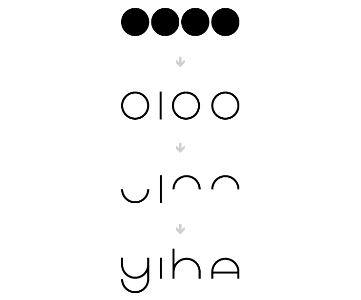
CONCEPT
The chicken or the egg, which one came first?
Business is helping business and vice versa.

LOGO
Playful, uplifting, positive, brings enthusiasm and fun.
Egg shaped, straight font with a highlighted exclamation mark
to become even more convincing.
BUSINESS CARD
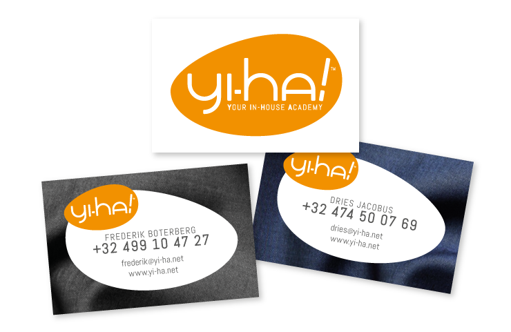
Front side is the opposite image of the back side.
Background is fabric of clothes / costume.
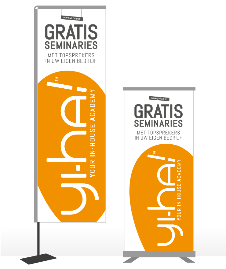
BEACHFLAG & BANNER
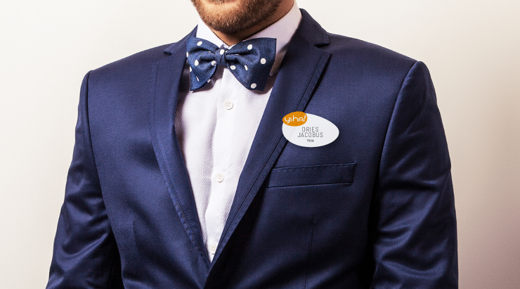
BADGE
©STUDIO SJALOT
